Oct 7, 2019
5 Usability Principles That Make Visitors Stick (and Boost Your SEO)
Does your site encourage visitors to stick around?
If not, that’s not only losing you customers – it’s also potentially damaging your SEO (search engine optimization).
The user’s experience has always been an important part of SEO … but it’s becoming ever more important. After all, Google (and other search engines) want to serve up content that suits the user’s needs. The RankBrain algorithm, for instance, uses AI to understand the intention behind a user’s search, so that Google can serve up the most relevant results.
Good usability is easier for visitors to do what they want to do (e.g. find and purchase a product) … improving your bottom line, and potentially giving your SEO a very handy boost.
Here are five key usability principles to follow as you develop your digital marketing strategy:
1: Don’t Make Me Think

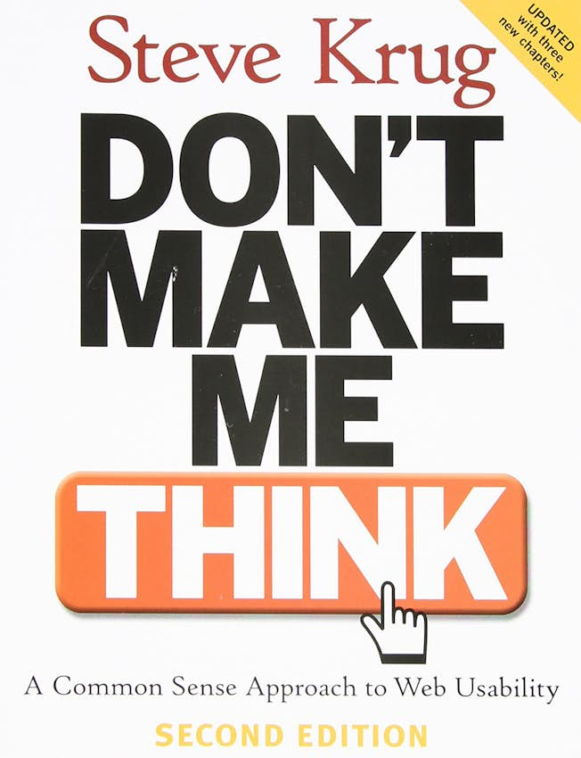
Steve Krug is a leading usability expert who has consulted for Apple and Bloomberg. His first law of usability is “Don’t Make Me Think” (which is also the title of his book). It’s not “nothing important should ever be more than two clicks away” or “speak the user’s language” or “be consistent”. It’s much more fundamental than that.
Many of your visitors will be preoccupied. They’re not fully focused on your site: they’re thinking about what to cook for dinner, or about the next task on their to-do list. You need to make it really easy for them to take the action they want to take: don’t make them hunt through a menu or sidebar to find the relevant link.
Did you know?
The brain represents just 2% of a person’s total body weight, but it accounts for 20% of the body’s energy use. Having to think too much definitely takes a toll!
Key takeaway:
Test your website to ensure it’s delivering a great user experience. Don’t make assumptions based on what the 'average user' might want: there is no such thing.
2: The Grunt Test
If you showed your website to a caveman, would they be able to “grunt” what your site is all about just from the homepage?
There’s a quick test for this, developed by Donald Miller, the founder of StoryBrand. It takes less than a minute and involves just three questions.
First, show your website to someone (who’s never seen it before) for five seconds, then close your laptop.
Then, ask them these three questions:
- What does my organization offer?
- How will it make your life better?
- What do you need to do to buy (or to get started)?
Did you know?
You have 0.05 seconds, less than a blink of an eye, to make a good first impression when a user visits your website.
Key takeaway:
Can users do what they need to do within five seconds of arriving on your website? If not, they’ll hit the back button.
3: The “Needs Met” Test
Does your website meet users’ needs? (This normally will mean it’s highly related to their query and it answers their question or lets them do what they set out to do.)
Google has a specific rating scale for this, which focuses particularly on mobile users … so it’s crucial that you make sure your site is optimized for them in particular. If your site doesn’t fulfill user’s needs (i.e. if they’re likely to return to search results to check out other sites instead), then you won’t rank very highly on this scale.
The scale can be found in their Search Quality Rating Guidelines document, on page 85.
Did you know?
According to Google, mobile users are five times more likely to abandon a task if a site isn’t optimized for mobile. This means that making your site mobile-friendly is crucial for both conversions and SEO.
Key takeaway:
With usability, it’s easy to end up focusing on how your site functions for desktop users (as you’re likely to be doing all your testing and tweaking on a computer). Mobile usability is crucially important, though, and Google’s focus on this when addressing “user needs” reflects their broader move toward mobile-first indexing.
4. The “KISS” Principle

Often, good design is simple design. Your site doesn’t need to be complex and flashy in order to impress.
The acronym “KISS” stands for “Keep it Simple, Stupid” (or, if you prefer “Keep it Short and Simple”). It means that your site should be easy to understand. That could include things like:
- Using clear navigation labels.
- Using standard-looking icons.
- Writing in a concise, straightforward way.
- Minimizing 'clutter' – elements on your site that aren’t necessary.
Did you know?
There are several other similar famous quotes and principles, including:
- Albert Einstein – “Make everything as simple as possible but not simpler”
- Leonardo Da Vinci – “Simplicity is the ultimate sophistication”
- Bjarne Stroustrup – “Make Simple Tasks Simple!”
Key Takeaway:
Make your website as simple and straightforward to use as possible. If you’ve got two options on how to do something, pick the simplest. For instance, having a single field for 'email' on your sign-up form is better than having three fields for 'first name,'” 'last name,' and 'email'.
5: The “Users Don’t Read Webpages” Rule
Few users will read even the whole of a single page on your site. Instead, they’ll scan for what they need.
Designers and usability experts have known this for a very long time: back in 1997, Jakob Nielson’s famous study found that “79 percent of our test users always scanned any new page they came across; only 16 percent read word-by-word” and more recent studies have found the same thing, even for content like blog posts, that you might expect people to read in detail.
Did you know?
People don’t read manuals, either. If you’re selling software or providing an online service (e.g. an online course), you’ll need to find other ways to help them get to grips with how this works, such as a guided tour or brief help text within the software.
Key Takeaway:
To get people to take in more of your content, make it easy to scan: that means using subheadings, bold text, and plenty of white space. You may also want to track which parts of your pages users are reading by using heatmapping software.
Usability is critical to the success of your site, and by following these five principles, you’ll be ensuring that people can quickly see what you do, recognize that they’re in the right place to get what they want or need, and take the appropriate action based on that … such as purchasing from you.
Related
Upgrade to Power Membership to continue
your access to thousands of articles, toolkits, podcasts, lessons and much much more.
Become a Power Member- Login
- View Courses
- - - -
- Courses
- Resources
- - - -
- My Account
- Change Password
- Logout


